
How to Review AI-Generated Creative Work Without Losing Your Taste
An eight-lens creative review framework for choosing, editing, and rejecting generated work.
The easy part is getting twenty options. The difficult part is explaining why option seven is merely competent, why option twelve has a live idea inside it, and why both still fail the brief.
That difficulty is not an embarrassment left over from the pre-generative era. It is the work. When production becomes cheap, selection becomes visible. Taste is not a mystical private preference; it is the ability to make and defend distinctions that matter to an audience, a brand, and a moment.
The problem with unedited output is not that it came from a model. It is that it often reaches the meeting before anyone has asked it to prove anything.
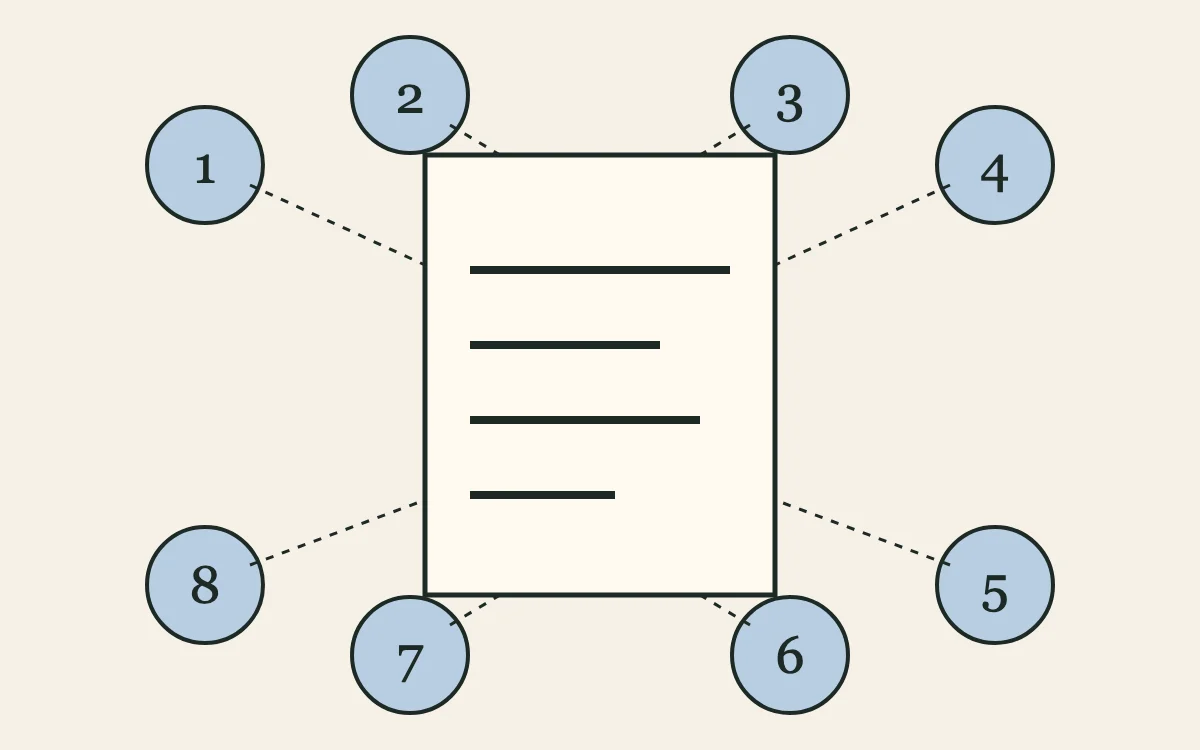
Use this framework after generation, not instead of a brief. It tells a team what to keep, change, test, or reject.
1. Idea: is there an actual proposition?
Start with the claim the work makes. A mood, genre, or visual treatment is not necessarily an idea. “Retro,” “playful,” and “premium” can describe thousands of interchangeable executions. Ask what the audience is meant to notice, reconsider, or feel compelled to do.
If you cannot phrase the proposition without pointing at the image, the work may be decoration rather than communication. Repair begins by returning to the tension in the brief: a contradiction, a trade-off, a belief the brand can credibly make visible.
2. Specificity: could this belong to anyone?
Generated work is very good at the centre of a category. It knows the familiar signals of sustainability, ambition, luxury, wellness, innovation, and youthfulness. That is exactly why a draft can look polished while saying nothing particular.
Replace general adjectives with details that could be checked. Which product behaviour? Which audience habit? Which constraint? Which historical reference? Specificity does not mean adding trivia. It means choosing information that makes a competing brand less able to claim the same result.
3. Cultural signal: what codes is it borrowing?
Every output arrives with references, whether the prompt named them or not. A visual may borrow the surface of a subculture, a language pattern may echo a tired category promise, and an image may carry assumptions about who is invited into the scene. Ask what the work is citing, what it leaves out, and whether the brand has earned the association.
This is a review question, not a ban on references. The point is to identify the code before it operates invisibly. NIST’s guidance on human-AI interaction is useful context: it stresses defining human roles and recognising that systems can lose necessary context when complex social practices are represented as measurable patterns. NIST’s appendix is a governance framework, not a creative-directing manual; the editorial inference here is that cultural judgment cannot be delegated to a similarity pattern.
4. Coherence: do concept, language, and execution belong together?
Review the headline, image, composition, tone, and call to action as one system. A sharp verbal idea can be undermined by an illustration that reaches for generic futurism. A restrained visual can be made clumsy by a grandiose headline. Coherence is not uniformity; it is the sense that each element is making the same argument in its own medium.
Make the team identify the mismatch in a sentence. “The words promise local knowledge, but the image could have been made for any global app” is a useful diagnosis. “It feels off” is the beginning of a conversation, not the end of one.
5. Distinctiveness: is it recognisable or merely competent?
Competence passes a production check. Distinctiveness gives someone a reason to remember and repeat the work. Test it without the logo. Hide the brand name and ask which category, voice, or point of view remains. Then place it beside three likely competitors. If the result disappears into the row, do not solve that by adding more ornament. Revisit the underlying choice.
This is where editing has to be willing to delete. Most output does not need another filter, flourish, or prompt variation. It needs a stronger decision.
6. Strategic fit: does it serve the real brief?
Generated work can optimise for an imagined brief: the most aesthetically coherent version of what it thinks a campaign should be. The actual brief may demand something less obviously beautiful and more useful—clarity for a new audience, a proof point that must survive scrutiny, a distinction from a competitor, or a signal to an internal team.
Bring the decision owner into this pass. Review against the audience, commercial reality, constraints, channels, and non-negotiables. Adobe’s Brand Studio describes a brand-side model in which creative technology works alongside brand expression and legal teams, with human oversight remaining central to work that is creative, responsible, and brand-true. Its account is a single-company case study, not evidence of a universal operating model. It does, however, name the collaboration generic output tends to erase.
7. Restraint: what should be removed?
Generation rarely argues for less. Review does. Remove the cliché reference, the second metaphor, the decorative sentence, the visual gesture that competes with the message. Restraint creates room for a real signal to register.
Try a subtraction pass: keep only the element that carries the idea, the proof that earns it, and the action the audience needs. If the work collapses, it never had a clear centre. If it gets stronger, the excess was disguising uncertainty.
8. Human judgment: which decision cannot be outsourced?
Finish with the question that prevents a review from becoming an elaborate scoring exercise: what must a person decide because they are accountable for the consequence? It may be whether a cultural territory is credible, whether a claim is fair, whether a risk is worth taking, or whether a competent direction should be rejected because the brand deserves a more specific one.
Name the owner beside the decision. This does not make the work slower; it stops the room from treating a generated option as a neutral fact.
Run the review in two passes
First, review independently. Give each reviewer the eight lenses and ask for evidence, not a score alone: one sentence for what works, one for what fails, one proposed repair. Independent notes reduce the tendency to mistake the loudest reaction for consensus.
Second, convene a decision pass. Sort the candidates into keep, repair, test, and reject. A candidate in repair needs a named change and an owner. A candidate in test needs a concrete uncertainty that audience feedback, legal review, or a small prototype could resolve. “Maybe” is not a category.
The downloadable creative work review checklist can carry this process into a real review. Pair it with the guide to avoiding generic creative work when the failure begins earlier, in the research or prompting stage.
Limits
No checklist turns taste into an objective score, and it should not pretend to. Different brands and audiences will make different defensible choices. This framework is an editorial tool for making those choices visible. It does not establish originality, legal clearance, accessibility, or cultural credibility on its own. Those require the appropriate specialist review—and, sometimes, the judgment to decide the output is not worth saving.
Practical resources
Evidence ledger
Sources
- 01How Adobe Brand Studio scaled its content and creativity with AI
- 02AI Risk Management Framework: Appendix C, AI Risk Management and Human-AI Interaction
- 03Creative Work Review Checklist
Links are descriptive and separated from editorial conclusions. Product behavior may change after the review date.
Next methods
Continue the work
guide · methods
How to Use AI Without Producing Generic Creative Work
A divergence-and-critique framework that protects a specific point of view.
analysis · methods
What AI Should Never Decide in a Brand Strategy
Use AI to broaden strategic analysis without handing it authority over what a brand should mean.
guide · tools
How to Use Claude for Brand Research
A staged evidence-led workflow for researching a brand with Claude while keeping claims traceable.